Intro
A pie chart, also known as a circle chart, is a circular graphic divided into sectors or slices that is used to illustrate the relationship of parts to the whole for a variable. The amount or number is proportional to the arc length of the sector it represents. In other words, it’s like a sliced pie, with each slice constituting a chunk of your data.
Pie charts are well-known and widely used graphic data presentation formats for business or statistical analysis. Despite this, they are not without flaws. It is an effective method of displaying data, but the number of elements is limited. To put it another way, if you need to present more than ten elements, a pie chart may not be the best option. The same is true for elements that are numerically close to each other. Small differences are difficult to see on a pie chart. In such cases, other types of charts, such as bar graphs, are preferable.
A pie chart is best suited for categorical or nominal data. With categorical values, data is divided into groups and represented in a specific order, such as answers ranging from “Strongly Negative” to “Strongly Positive.” Nominal data are values that have no particular order, such as country of residence.
Pie chart types
Pie charts can be viewed in two ways.
Dimensional graphs
This classification is based on the number of dimensions for your pie chart, which are 2D and 3D.
2D pie graph
A 2D pie chart is a circular graph that displays data entries in two dimensions. It is the most common and classical form.
The following subtypes of 2D circle charts exist.
Simple or Basic pie chart
When discussing a pie chart, this is the most basic form that comes to mind. Each value adds up to a total of one. Other types of 2D pie charts depict the same data in a different way.

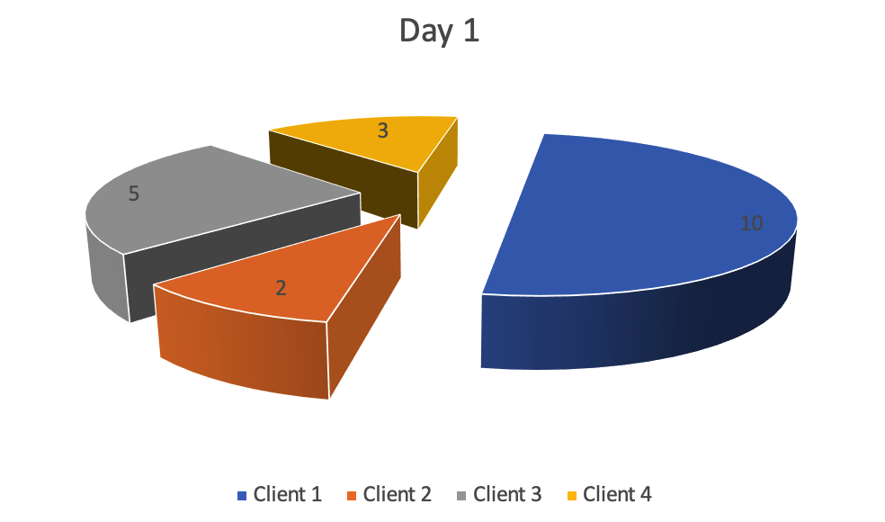
Exploded pie chart
Simply separate a slice or slices from a pie to make this form. This type is appropriate when it is necessary to represent the contribution of each value while emphasizing the role of a specific sector or sectors. As in the image, you want to highlight the importance of thedark-blue sector, which could be data for a valued customer or sales results for a specific product.

Pie of Pie
This is the graph to use when you need to display a large number of items or when you have a set of small slices that would be difficult to read with a simple pie chart. In essence, a pie chart is exactly what its name implies. It takes some values from your main pie and creates a second pie chart based on them. In our example, we show data for gray and yellow colors from an existing pie graph separately, which constitutes the blue section on the main chart.

Bar of Pie
In reality, it’s just another way to display more data categories, making analysis easier. As in the Pie of Pie, you take some values from your main pie chart and stack them together to form a stacked bar. In our example, we show data for blue and green colors separately from an existing pie chart.

3D pie chart
A 3D pie graph is, as the name implies, a method of presenting data in three dimensions. At the same time, it is the second type for pie chart dimensional classification. It appears that you can provide more data in a graph with another dimension, but this is not the case. Such 3D visualization is mostly used for aesthetic purposes. Furthermore, it may make reading the chart more difficult. There are only two more subtypes to discuss.
Simple 3D pie graph
It is simply a 3D version of a simple pie chart with the same values. You only see your data in three axes.

Exploded 3D pie chart
Similar to how a 3D simple pie chart is a version of a 2D circle graph, an exploded 3D pie chart is a version of an exploded 2D pie chart with similar objectives and usage.
Calculating a pie graph
Whatever pie chart type you choose, they all follow the same calculation principles. To begin, the pie chart data can be displayed as degrees or percentages.
The following formula is used to calculate your percentage, which is the most common option:
(Value/Total Value) * 100 = Value %
To display your data as degrees, change the formula slightly:
(Value / Total value) *360 = Value degree
You must assign a value to each piece of data – for example, a product or a customer – and calculate a percentage for each pie sector. Then you can make your final circle graph.
There are, however, ways to achieve the same result in a faster and easier manner.
Aspose Chart app
The Aspose Chart app allows you to create various pie charts in seconds, online and for free. You can do this by going to either the main Chart app page or the PowerPoint Pie Chart Online one.
- You must first provide your data. It can be uploaded as an Excel file or manually filled out.
- Select your desired chart type. For instance, a simple pie chart.
- You can now create your chart and save it in a variety of file formats, including PNG, PPT, PDF, ODP, XPS, DOC, TIFF, JPEG, BMP, EXIF, and others. You can see a preview of the final result if necessary.
Final words
As previously stated, a pie graph is a popular tool for representing your data as a parts-to-whole relationship. You must exercise extreme caution when it comes to the number of items displayed on the graph. Also, keep in mind that pie charts are best for comparing a specific category or type (a pie slice or a sector) to the total (the entire pie) when the values are not too small, ideally around 25 or 50%.
It is important to note that the Aspose Chart app is one of the most effective and simple tools for creating charts. There is also the Aspose.Slides app family, which can assist in creating the best-looking presentations with a variety of visual, audio, and effects.